We can read all we want about what people do and how things work. But I personally find it more valuable to see examples. Real-life, concrete, behind-the-scenes, examples. Which is why I’m highlighting one of my recent projects here. My goal? To give you a taste of what a branding project looks like from start to finish when working with Sweet Boo.
Let me proudly introduce Project Hope Autism Services. Founded by Deborah Collins and Rebecca Birchfield, Project Hope Autism Services was developed to meet the growing need for services in the Autism Community in Palm Beach County. Between them, these two women have MANY degrees (including medical) as well as real-life experience (Deborah as a mom, Rebecca as a teacher) with children with Autism. Let me tell you, they are going to be game-changers.
For me, this was a dream project; clean slate, impactful mission and open minds. After our initial consultation to determine goals for the project and a signed proposal, it was go time. First up: the Branding Questionnaire.
BRANDING QUESTIONNAIRE
This is the money piece of discovery. You’ve heard me talk repeatedly about this in my newsletter: I can’t do my job well if I don’t know who you are and what you want. These questions will make you think and discover things about your business/mission/product that you may not have realized. Without this, I can give you something pretty, but it may not be relevant, which means we will miss our goals. I made sure that Deborah and Rebecca both did their homework, as all decision-makers need to be involved at this stage.
DESIGN PRESENTATION
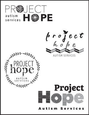
With all that good information, I got down to designing. My contract includes providing three unique designs to review, but sometimes my creative juju overflows. Below left are the initial designs I presented. The feedback was good; we discussed what was liked, disliked, things to try, etc. Why are they in black and white? I have found that when I present a variety of designs AND different color palettes, it can be very overwhelming. Plus, it’s important that your logo works well in black and white, so we start there. You’ll see where color comes in soon. And I always do this stage in person; I find it critical to see your reaction to what I present, plus it’s just more fun.
|
DESIGN REVISIONS
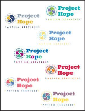
After all of the feedback, I headed back to the initial designs and worked on the things we discussed. At that point, it is easy to review and discuss these revised logos over email. Deborah and Rebeccah were super responsive in providing their input, so we were able to keep the process moving quickly. We then settled on the final logo (above right) and it was time for colors.
COLOR PALETTES
This is a REALLY fun part of the process. We know the design, now how about the colors. You know you’ve been wondering about them from day one. 🙂 We’ve discussed them in the Branding Questionnaire, you’ve shared your thoughts, so let me work my magic for you here. (Below left)
FINAL LOGO
And there you have it. We’ve gone from a blank page to a logo. Your real life logo for the vision you’ve had which is taking shape. (Below right) Seeing the excitement in Deborah’s and Rececca’s eyes made this such a meaningful part of the project.
|
NEXT STEPS
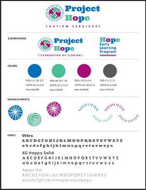
You’ve got a logo, so now what? I then created a Branding Sheet (above right) for Project Hope, which is our blueprint moving forward for any marketing and collateral pieces we’re going to create. We’re currently in the middle of business and rack cards, but the website just went live, which you can visit here. It was designed by the very talented Michelle Lara at Luxe Lara. Working in tandem, her web expertise and my branding resulted in what we feel is an inviting, exciting and accessible site for families navigating the complex world of autism services.
Was this a helpful example? I’m always interested in how I can help educate my audience and simplify how things work at Sweet Boo Design. If you’d like to discuss ways that YOU could be featured in a case study, email me here or call me at 561.578.7019.